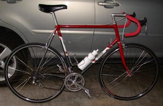
There are some God awful paint schemes on Fuso frames out there: Not my fault.
 Wed, May 17, 2006
I recently saw a comment posted on Classic Rendezvous Bike List saying something like, “Picked up a Fuso recently with weird purple and yellow paint.”
When I introduced the Fuso frame in 1984 I offered it in four very tasteful (I thought.) color schemes. There was my favorite Charcoal Grey Metallic and Red (Pictured below.) Red and Silver Metallic, Dark Blue Metalic and Light Blue Metallic, and Dark Plum with Lilac Metallic.
I was trying to keep costs down and by limiting color choice to four meant I could paint batches of frames all the same and keep them in stock for immediate delivery. Almost from the beginning I started getting requests for this color and that color. I refused at first but after fighting it for two years, I gave in, simplified the decal design, dropped the metal head badge (I had to cut costs somewhere.) and offered the Fuso painted to order in 1, 2, or 3 colors and offered at least a dozen colors to choose from.
Through the latter half of the 1980s I painted some pretty garish color combinations at my customer's request. As well as the Purple/Yellow afore mentioned there were a lot of Powder Blue and Pink, Turquoise and Pink, Green and Purple and every other stomach turning combination you can think of. I hated it, but I was running a business and like all successful businesses I was giving the customer what they wanted.
You have to remember people ordering these frames were from a generation who grew up in the 1960s psychedelic era and maybe partook of a little too much pot or LSD in their youth. After that came the 1970s when kitchens throughout America were equipped with Avocado Green refrigerators. Red and green plaid pants worn with a striped or polka-dot shirt was the height of fashion.
The 1980s were no better, this was the era when bicycle shorts and fanny-packs became fashion items. People who grew up in this era did so in a cultural and artistic wilderness where every speck of good taste had evaporated like water from the desert. It is interesting that now everyone has come out of the drug induced haze of those former years, peoples taste in just about everything has improved immensely.
The people who ordered these frames cannot be blamed, they knew no better and it looked cool at the time. Now they look as outdated as a pair of yellow polyester pants, and like the polyester pants they will last forever so they are going to be around for a long time.
I make no apologies for these God awful paint schemes. I’m not particularly proud of them but like Oliver North, I was just following orders. If you want a nice looking Fuso, look for what I call the first generation in the original four color schemes offered. And not all frames that came later were garish; there were a few people around with good taste.
The person, who commented on his purple and yellow Fuso that prompted this piece, also said “I would have preferred red and yellow, but then someone else may have snapped it up.” So there you have it; because people balk at these wild and crazy color combos, there are bargains to be had out there, and if you maybe wear some really dark glasses you will find that under the gaudy paint there is a bike that is built to be ridden.
Maybe in time you will grow to like the bike enough that you will spring for a repaint. In which case you will be doing me a huge favor, and making the world a better place by removing one more piece of visual pollution.
 Dave Moulton | Comments Off |


Reader Comments (3)
Too funny. I've often wondered how it felt for creators to see their work outfitted in a way they didn't care for.